Feature
16 movie poster traditions that need to die in a horrible fire
Movie Feature
Ali
6th February 2011
I see about a hundred movie posters every day. Some are good, some are so-so but most are dreadful. I'm drawing a line in the sand: any poster that features any one of these frightfully clichéd design cues is getting pissed on in public. It's time to take a urine-soaked stand!
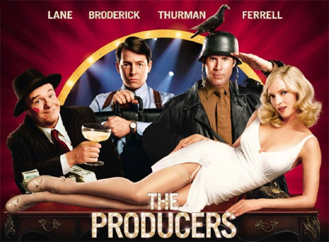
I'll just about accept 'From the director of...' on a poster as that implies a direct connection between one film and another - there's every chance that if you liked one film you'd like another from the same person. But trailing a film as 'From the producers of...' is just silly. They likely had very little to do with the quality of either film, they just agreed to let someone else make it while they wore a baseball cap and did a line of coke. Stop it.
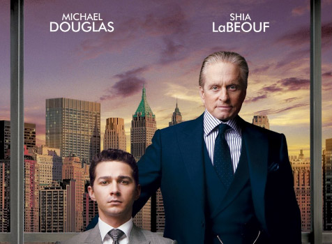
One of these men is Shia LaBeouf. Try to guess which one!
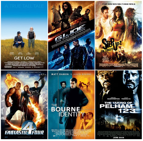
This has been done to death, and with good reason - orange and blue are two of the most complimentary colours, and what with skin tones, the sun and the sky, they're also the most commonly found. That doesn't mean every poster artist has permission to jack up the contrast and take design cues from an Orangina bottle. Red's quite a nice colour, you know.

Really, James Cameron? The most expensive movie ever made, and all your poster department could manage was Papyrus? Why not slap some Comic Sans on there and be done with it. Wingdings would be an improvement.
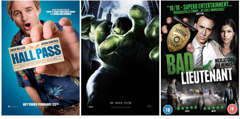
I get that it's difficult to convey depth in a 2D medium like print, but that doesn't excuse the frequent thrusting of monster appendages into our faces. What next, movie posters you need 3D glasses to see? Oh God, that's definitely going to happen, isn't it?
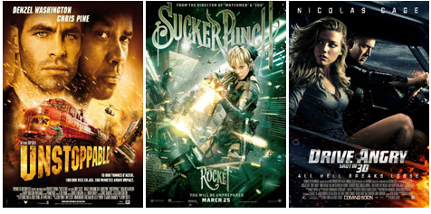
I believe this phenomenon is already well documented.
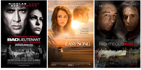
It's the laziest of design motifs - just chuck the star's giant head at the top of the poster and hope no one notices it's just floating there like an out-of-control blimp. That poor guy on The Last Song poster didn't even get a neck, he's drifting towards oblivion (but away from Miley Cyrus at least).
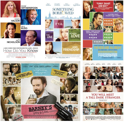
Does your movie lack anything approaching interesting key art? Stuck for an idea for a poster? Idea: just get as many stills as you can, paste them all onto your one sheet, turn up the pastel colours and pass it off as a quaint, indie collage. Now watch the Independent Spirit Awards roll in!
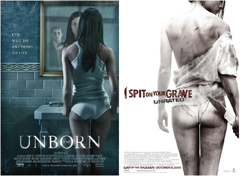
I love an arse as much as the next man, but this is just sad. It's almost an admission by the studio that says, 'Look guys, this movie hasn't really got much... but it does have an arse! You like arses, this we know!'
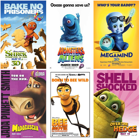
Fact: you have to come up a poster pun on the spot when you interview for a job at DreamWorks. Before you even sit down.
"We're making a movie about a dog who's blasted into space. PUN ME!"
"Err... 'Bark side of the Moon'?"
"Welcome aboard!"
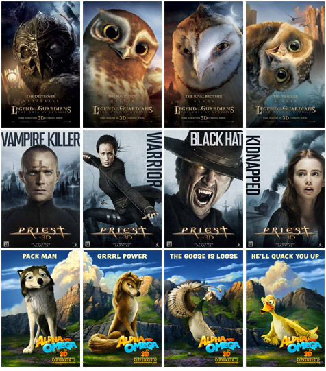
"Well thank god they saw fit to release a separate poster for every character from Alpha And Omega. My week just won't be complete until I rip every last one down from all the bus stops in my town!"
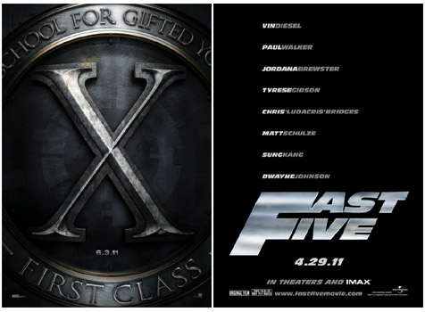
Why not just put the press release on the poster instead?
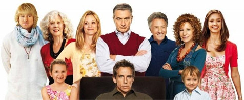
What the hell are you all looking at? Focus, dammit! This Little Fockers poster is a prime example of awkward comping, where it's obvious that not everyone in the picture was in the room. That's excusable, but the least the designer could have done was made the characters look like they were from the same universe. Unless there's a breakdancing unicorn festival kicking off behind the cameraman, that's just a basic Photoshop fail.
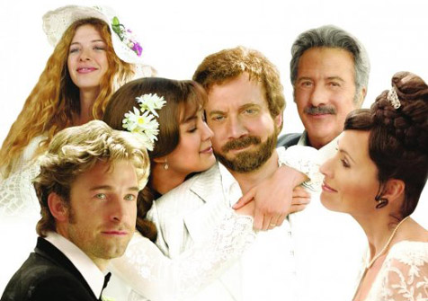
Dustin Hoffman photobomb alert! Barney's Version's original poster was awful in several ways, but this one sheet suffers from that most heinous of crimes: a head transplant. I'll wager dollars for donuts that's not Paul Giamatti's body, and those aren't Rosamund Pike's hands either. The entire movie is a lie! Also note an ethereal Rachelle LeFevre hovering like a ghost in the background and Minnie Driver travelling forward through time on her wedding day to stare at Scott Speedman's forehead.
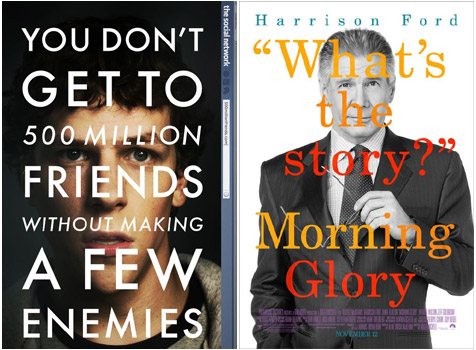
You can guarantee, as soon as one poster gains infamy for trying something a little different, a few months you'll see a whole host of imitators doing a less successful job. Take The Social Network poster - yes, it's daring to have text all over your lead's face, but it works in context and, let's face it, Jesse Eisenberg isn't going to fill seats on his own.
Then came Morning Glory, which had the audacity to slap Harrison Ford across the face with giant letters. Why? Is it even in keeping with the theme of the movie? Even The King's Speech recently jumped on the bandwagon and that's about to win 48 Oscars.
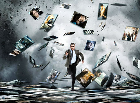
But whatever it is, it can't be allowed to happen again. (*unzips*)

Follow us on Twitter @The_Shiznit for more fun features, film reviews and occasional commentary on what the best type of crisps are.
We are using Patreon to cover our hosting fees. So please consider chucking a few digital pennies our way by clicking on this link. Thanks!
Support Us
Follow Us
Recent Highlights
-
Review: Jackass Forever is a healing balm for our bee-stung ballsack world
Movie Review
-
Review: Black Widow adds shades of grey to the most interesting Avenger
Movie Review
-
Review: Fast & Furious 9 is a bloodless blockbuster Scalextric
Movie Review
-
Review: Wonder Woman 1984 is here to remind you about idiot nonsense cinema
Movie Review
-
Review: Borat Subsequent Moviefilm arrives on time, but is it too little, or too much?
Movie Review
Advertisement
And The Rest
-
Review: The Creator is high-end, low-tech sci-fi with middling ambitions
Movie Review
-
Review: The Devil All The Time explores the root of good ol' American evil
Movie Review
-
Review: I'm Thinking Of Ending Things is Kaufman at his most alienating
Movie Review
-
Review: The Babysitter: Killer Queen is a sequel that's stuck in the past
Movie Review
-
Review: The Peanut Butter Falcon is more than a silly nammm peanut butter
Movie Review
-
Face The Music: The Bill & Ted's Bogus Journey soundtrack is most outstanding
Movie Feature
-
Review: Tenet once again shows that Christopher Nolan is ahead of his time
Movie Review
-
Review: Project Power hits the right beats but offers nothing new
Movie Review
-
Marvel's Cine-CHAT-ic Universe: Captain America: Civil War (2016)
Movie Feature
-
Review: Host is a techno-horror that dials up the scares
Movie Review
