Feature
Gather round folks for a good old-fashioned poster cornholin'
Movie Feature
Ali Gray
27th February 2014
How bad is this new poster for Seth MacFarlane's A Million Ways To Die In The West? Let me count the ways.
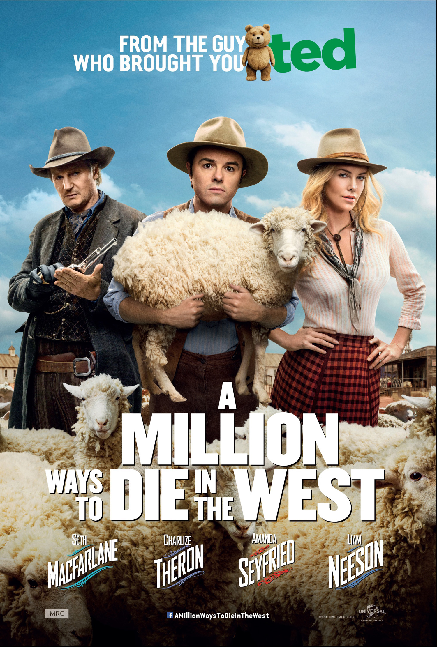
Let's work from the top down. First of all, I can appreciate that Ted was a monster success and you'd want to shout about it. But do we really need to be reminded of what Ted looks like on the poster? And was the Ted title treatment really so memorable and important we have to endure its sickly green on an otherwise colour-balanced poster?
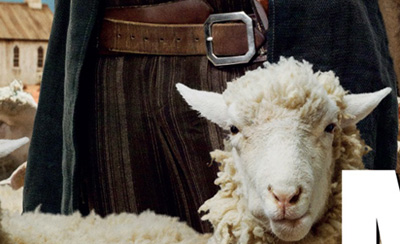
He's holding a sheep? That is stone-cold fucking hilarious, bro. I wouldn't have thought anyone could come up with a visual gag that breathtaking until I saw it was from the guy who brought us Ted. I don't believe he's even holding that sheep. It's not even a real sheep.
Are sheep massively important in this film? I'm going to hazard a guess and say 'no'. Then why are they taking up around 50% of the real estate on this poster? It's distracting. Apart from the hats, and the word 'West' in the title, you would otherwise have no idea this movie was even supposed to be a Western. There's that small crap-shack vista crammed underneath Charlize Theron's hand, but that's it.
If you'd care to look closelier, you'll see they have Photoshopped a bulge in Liam Neeson's character's trousers. Because he's supposedly well-hung. The sheep's expression pretty much matches mine exactly.
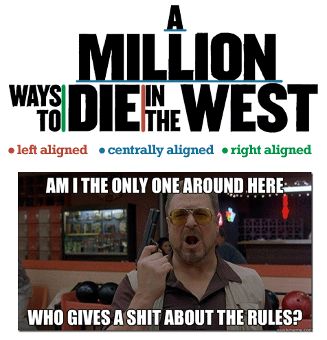
Finally, the title treatment. That is an absolute car crash of a title treatment, although in fairness to car crashes, they can sometimes look cool. Why the plain, Impact-esque font when you have such lovely typography for the cast? Why the white on an off-white background? Do you read from left to right or top to bottom? Is the text centre aligned, left aligned or right aligned? You can't have all three. You just can't. That's like having your cake, eating your cake and regurgitating your cake to sell it on eBay. It's like the first thing you learn at Font School. You would be shot in the Old West for such reckless displays of font alignment.
Come to think of it, why isn't it called 'One Million Ways To Die In The West'? Who starts the title of their film with the word 'A' anyway? Apart from A Prophet, but that's a translation. Seth MacFarlane, you are not Jacques Audiard and you never will be. Stop trying to be Jacques Audiard.
In conclusion then, Seth MacFarlane is shit, this poster is shit and sheep are shit. Let's all go to the pub.

Support Us
Follow Us
Recent Highlights
-
Review: Jackass Forever is a healing balm for our bee-stung ballsack world
Movie Review
-
Review: Black Widow adds shades of grey to the most interesting Avenger
Movie Review
-
Review: Fast & Furious 9 is a bloodless blockbuster Scalextric
Movie Review
-
Review: Wonder Woman 1984 is here to remind you about idiot nonsense cinema
Movie Review
-
Review: Borat Subsequent Moviefilm arrives on time, but is it too little, or too much?
Movie Review
Advertisement
And The Rest
-
Review: The Creator is high-end, low-tech sci-fi with middling ambitions
Movie Review
-
Review: The Devil All The Time explores the root of good ol' American evil
Movie Review
-
Review: I'm Thinking Of Ending Things is Kaufman at his most alienating
Movie Review
-
Review: The Babysitter: Killer Queen is a sequel that's stuck in the past
Movie Review
-
Review: The Peanut Butter Falcon is more than a silly nammm peanut butter
Movie Review
-
Face The Music: The Bill & Ted's Bogus Journey soundtrack is most outstanding
Movie Feature
-
Review: Tenet once again shows that Christopher Nolan is ahead of his time
Movie Review
-
Review: Project Power hits the right beats but offers nothing new
Movie Review
-
Marvel's Cine-CHAT-ic Universe: Captain America: Civil War (2016)
Movie Feature
-
Review: Host is a techno-horror that dials up the scares
Movie Review