Feature
Shock: Movie posters used to be much nicer to look at
Movie Feature
Ali
31st March 2013
I spend approximately eight hours per day staring at film posters, and the other sixteen thinking about the various ways I hate them. It's always nice, then, when I'm given an excuse to figuratively go back in time and look at the film posters of yesteryear, specifically the one-sheet for Alfred Hitchcock's The Birds, which is 50 years old this week.
The reason I'm on this huge downer is because this week, while researching a feature on the 50th anniversary of The Birds (over here, if you're at all interested), I found the movie's original theatrical poster, and instantly fell in love with it. It's quirky, effective and unmistakably Hitchcock. Why isn't it on my wall RIGHT NOW.
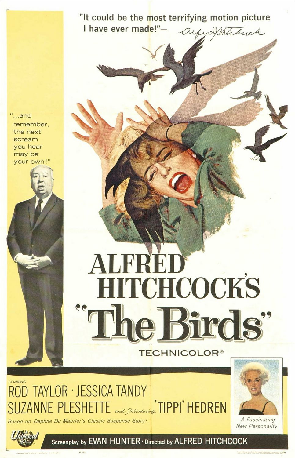
Where do I start? LOVE: Hitchcock providing his own poster quote and signing off on it. LOVE: the beautiful yet quite horrifying artwork. LOVE: introducing star Tippi Hedren as "A Fascinating New Personality". LOVE: the utterly inoffensive pastel colour scheme. The whole thing just screams class, even though the film is about angry pigeons or whatever.
Flash-forward 50 years, and movie posters have to scream their message from the multiplex walls, in case the poster hung next to it is gaudier or busier. In fact, movie posters are not designed to be hung on walls at all: they are designed to catch the eye whatever the cost. Usually this means photos airbrushed to the point of distraction, tried-and-tested colour schemes and repetition of recently popular poster trends.
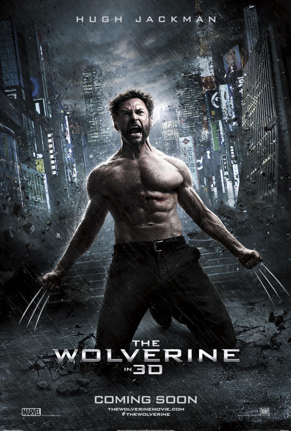
Take this poster for The Wolverine, for example. It's far from the worst poster I've seen so far this year, but it's symptomatic of what's expected from a blockbuster poster in 2013. Note the ridiculous level of Photoshoppery and desaturation. The dark clouds and the rain which clumsily attempt to set the mood. Flying debris for no fucking reason.
There isn't a square inch on this poster that hasn't been processed with a dozen layers in Photoshop. The result is a one-sheet that looks utterly ordinary; if it wasn't for the title treatment and the shirtless Hugh Jackman bellowing at the sky, it could be advertising any studio blockbuster from the last five years. Batman? Avengers? Looper? Yeah, why not.
I'm not asking for poster designers to consciously ape the designers of the 60s, and the fact is, even if one did and made a hugely popular retro-styled poster, ten others would be copying it before the year was out. All I'm saying is that fortune favours the bold and all that. The only real way to catch the attention of cinemagoers is to show them something they've never seen before. The likes of Olly Moss and the guys at Mondo excel at designing eye-catching conceptual posters, so why not take a risk and hire them to put ink to paper and design a blockbuster poster?
I've covered my dislike of modern poster trends before so I'm hardly treading new ground. The Wolverine even had a few nice teaser posters that were a little more boldy designed. But it's only when you get a glimpse of some truly classic posters that you get the perspective the art form deserves, and things aren't looking so great from this end right now. Who'll be the first to change the picture? 
Support Us
Follow Us
Recent Highlights
-
Review: Jackass Forever is a healing balm for our bee-stung ballsack world
Movie Review
-
Review: Black Widow adds shades of grey to the most interesting Avenger
Movie Review
-
Review: Fast & Furious 9 is a bloodless blockbuster Scalextric
Movie Review
-
Review: Wonder Woman 1984 is here to remind you about idiot nonsense cinema
Movie Review
-
Review: Borat Subsequent Moviefilm arrives on time, but is it too little, or too much?
Movie Review
Advertisement
And The Rest
-
Review: The Creator is high-end, low-tech sci-fi with middling ambitions
Movie Review
-
Review: The Devil All The Time explores the root of good ol' American evil
Movie Review
-
Review: I'm Thinking Of Ending Things is Kaufman at his most alienating
Movie Review
-
Review: The Babysitter: Killer Queen is a sequel that's stuck in the past
Movie Review
-
Review: The Peanut Butter Falcon is more than a silly nammm peanut butter
Movie Review
-
Face The Music: The Bill & Ted's Bogus Journey soundtrack is most outstanding
Movie Feature
-
Review: Tenet once again shows that Christopher Nolan is ahead of his time
Movie Review
-
Review: Project Power hits the right beats but offers nothing new
Movie Review
-
Marvel's Cine-CHAT-ic Universe: Captain America: Civil War (2016)
Movie Feature
-
Review: Host is a techno-horror that dials up the scares
Movie Review