Feature
The problem with Sam Raimi's Oz prequel, illustrated by its own poster
Movie Feature
Ali
10th November 2012
There's something about Sam Raimi's Oz: The Great And Powerful that's been bothering me: it appears to be being marketed as Alice In Wonderland 2: The Rendering.
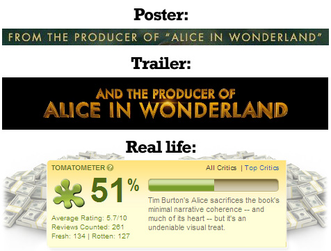
Maybe your experience of Alice In Wonderland was different from mine, but I thought it was a gaudy, over-saturated, technicolour nightmare – like a sparkly unicorn turd that went on to sell for a billion dollars.
The new posters for Oz: The Great And Powerful are doing nothing to dissuade the comparison with the box-office-busting fairytale. The trailers present Oz as a world bustling with colour and life – that's how it should be, given that The Wizard Of Oz was the first movie many audiences ever saw in colour. But I fear a CG universe, like the overblown, over-busy Oz we've seen so far, doesn't even come close to representing a similar technological leap. Yellow brick roads and Munchkins? Try GARISH DIGITAL LANDSCAPES and MINI FLYING GOBLINS and TREEBEASTS and BILLIONS OF FLYING MONKEYS and HOT PIXEL RENDERING for size.
Sam Raimi understands your concern. He knows you can't tell a story with location alone. That's why he's focusing on what really matters: the characters and the story. Just listen to him quell your fears.
It's about finally recognizing that the things you do in this world have consequences, and how to be the best person you can be. That's really the story of this film. It's about recognizing the mistakes we've made and moving past them, and growing into something better than you were when you started out.
The most exciting type of story for me is the one with a little bit of character growth, and I think James Franco's character has a little bit of growth in this story."

The other 99.862%? Horrible CG bullshit, arranged in a horrendous montage that makes a trip to Oz look as about as appealing as having your breakfast cereal spiked with industrial strength LSD. Three flying CG creatures get more poster space than Franco; even the 'hilarious' comedy dwarf is ten times his size (way to throw off any sense of scale, guys).
Oz: The Great And Powerful looks like it's being sold as a spiritual successor to Tim Burton's Alice rather than a prequel to One Of, If Not The Greatest Films Of All Time. It's telling that the black and white portion of the trailer - meant to represent the time before true creativity enters Oz's life - is by far the most visually arresting. 
Support Us
Follow Us
Recent Highlights
-
Review: Jackass Forever is a healing balm for our bee-stung ballsack world
Movie Review
-
Review: Black Widow adds shades of grey to the most interesting Avenger
Movie Review
-
Review: Fast & Furious 9 is a bloodless blockbuster Scalextric
Movie Review
-
Review: Wonder Woman 1984 is here to remind you about idiot nonsense cinema
Movie Review
-
Review: Borat Subsequent Moviefilm arrives on time, but is it too little, or too much?
Movie Review
Advertisement
And The Rest
-
Review: The Creator is high-end, low-tech sci-fi with middling ambitions
Movie Review
-
Review: The Devil All The Time explores the root of good ol' American evil
Movie Review
-
Review: I'm Thinking Of Ending Things is Kaufman at his most alienating
Movie Review
-
Review: The Babysitter: Killer Queen is a sequel that's stuck in the past
Movie Review
-
Review: The Peanut Butter Falcon is more than a silly nammm peanut butter
Movie Review
-
Face The Music: The Bill & Ted's Bogus Journey soundtrack is most outstanding
Movie Feature
-
Review: Tenet once again shows that Christopher Nolan is ahead of his time
Movie Review
-
Review: Project Power hits the right beats but offers nothing new
Movie Review
-
Marvel's Cine-CHAT-ic Universe: Captain America: Civil War (2016)
Movie Feature
-
Review: Host is a techno-horror that dials up the scares
Movie Review