Feature
Assessing the jauntiness of Silver Linings Playbook from its myriad logos
Movie Feature
Ali
19th November 2012
The poor bastards in charge of Silver Linings Playbook in the UK have their work cut out for them, given that the film features no aliens, robots or vampires. What it does have is people with mental illness. How best to represent that on the poster? Why, jaunty lettering, of course!
Then, for UK audiences at least, the word 'Playbook' was also deemed surplus to requirements - although, bizarrely, rather than change the title outright, the studio decided to write it in tiny letters on all promotional materials. The voiceover guy on the UK trailers doesn't even acknowledge it, calling it simply 'Silver Linings'. It's not out for another week, so who knows what it'll be called on release? Silver? Linings? Perhaps you just order your ticket by pulling a confused shrug at the cinema's ticket desk.
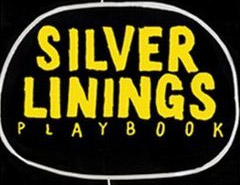
I haven't seen the movie yet, but on the surface it looks to be about two lost people trying to discover an identity for themselves - fitting, because from its marketing, Silver Linings Playbook is a movie that seemingly has no idea what it wants to be. Here's the sporty logo from the US poster:

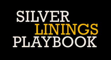
Now here's a nice serif logo from the US trailer:

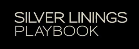
Now here's another logo, sans serif, from a different US trailer:

By the time the film reached the UK, it had this meatier logo on its quad:

Is a little consistency too much to ask for? Pick a damn font and stick to it, you guys. If you keep changing the film's title, the least you could do would be to give the movie a consistent visual identity. I guess I should be grateful they didn't just slap on some Comic Sans and be done with it.
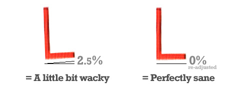
Then, while watching Homeland on telly, a UK trailer for "Silver Linings" played in the ad breaks. It used another logo, but this time with one crucial yet subtle difference. Can you spot it?

Well? Did you notice? That's right: because the movie is about people with varying degrees of mental illness (Bradley Cooper's character is undiagnosed bipolar, Robert De Niro is OCD, Jennifer Lawrence receives psychiatric help), some of the letters are a bit wonky. CRUSHED IT.
Wonky letters on a poster are a surefire sign that the movie which they are advertising is "crazy" or "bonkers" or "starring Jack Black". Jaunty lettering is visual shorthand for frivolity. They say "Weird and wonderful things will happen in this movie. Not like those other movies, with their straight-as-a-die typography. We like to bend the rules ever so slightly."

So there we have it. According to all promotional materials, Silver Linings Playbook is precisely 2.5% jaunty and around 97.5% schizophrenic. That's probably about right, actually. Dammit.

Follow us on Twitter @The_Shiznit for more fun features, film reviews and occasional commentary on what the best type of crisps are.
We are using Patreon to cover our hosting fees. So please consider chucking a few digital pennies our way by clicking on this link. Thanks!
Support Us
Follow Us
Recent Highlights
-
Review: Jackass Forever is a healing balm for our bee-stung ballsack world
Movie Review
-
Review: Black Widow adds shades of grey to the most interesting Avenger
Movie Review
-
Review: Fast & Furious 9 is a bloodless blockbuster Scalextric
Movie Review
-
Review: Wonder Woman 1984 is here to remind you about idiot nonsense cinema
Movie Review
-
Review: Borat Subsequent Moviefilm arrives on time, but is it too little, or too much?
Movie Review
Advertisement
And The Rest
-
Review: The Creator is high-end, low-tech sci-fi with middling ambitions
Movie Review
-
Review: The Devil All The Time explores the root of good ol' American evil
Movie Review
-
Review: I'm Thinking Of Ending Things is Kaufman at his most alienating
Movie Review
-
Review: The Babysitter: Killer Queen is a sequel that's stuck in the past
Movie Review
-
Review: The Peanut Butter Falcon is more than a silly nammm peanut butter
Movie Review
-
Face The Music: The Bill & Ted's Bogus Journey soundtrack is most outstanding
Movie Feature
-
Review: Tenet once again shows that Christopher Nolan is ahead of his time
Movie Review
-
Review: Project Power hits the right beats but offers nothing new
Movie Review
-
Marvel's Cine-CHAT-ic Universe: Captain America: Civil War (2016)
Movie Feature
-
Review: Host is a techno-horror that dials up the scares
Movie Review
