News
Shit movie poster maths
Movie News
Ali
6th September 2011
How to take two lovely movie poster designs and combine them to make one almighty pile of shit.
So what happens when you put them together for the Dutch poster?
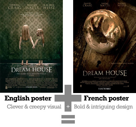

Click image for full-size picture
Here ends today's lesson in shit movie poster maths. 
Follow us on Twitter @The_Shiznit for more fun features, film reviews and occasional commentary on what the best type of crisps are.
We are using Patreon to cover our hosting fees. So please consider chucking a few digital pennies our way by clicking on this link. Thanks!
Support Us
Follow Us
Recent Highlights
-
Review: Jackass Forever is a healing balm for our bee-stung ballsack world
Movie Review
-
Review: Black Widow adds shades of grey to the most interesting Avenger
Movie Review
-
Review: Fast & Furious 9 is a bloodless blockbuster Scalextric
Movie Review
-
Review: Wonder Woman 1984 is here to remind you about idiot nonsense cinema
Movie Review
-
Review: Borat Subsequent Moviefilm arrives on time, but is it too little, or too much?
Movie Review
Advertisement
And The Rest
-
Review: The Creator is high-end, low-tech sci-fi with middling ambitions
Movie Review
-
Review: The Devil All The Time explores the root of good ol' American evil
Movie Review
-
Review: I'm Thinking Of Ending Things is Kaufman at his most alienating
Movie Review
-
Review: The Babysitter: Killer Queen is a sequel that's stuck in the past
Movie Review
-
Review: The Peanut Butter Falcon is more than a silly nammm peanut butter
Movie Review
-
Face The Music: The Bill & Ted's Bogus Journey soundtrack is most outstanding
Movie Feature
-
Review: Tenet once again shows that Christopher Nolan is ahead of his time
Movie Review
-
Review: Project Power hits the right beats but offers nothing new
Movie Review
-
Marvel's Cine-CHAT-ic Universe: Captain America: Civil War (2016)
Movie Feature
-
Review: Host is a techno-horror that dials up the scares
Movie Review